Showing posts with label David Kaihoi. Show all posts

Wednesday, September 15, 2010

Luxe lavender

Room by Katie Ridder from Elle Decor

From quietly ethereal to playfully polished, the purple color family has a rich and luxurious feel that imparts a regal presence in a room. It was a color favored by Roman emperors and medieval kings, and is still a go-to shade for those seeking that hint of subtle glamour.

As I look at these pictures, I am amazed at the variety of moods that purple can convey. The paler shades, like the one above, have such a serene quality, a dusky glow, and make you relax a little just looking at them.

The brighter versions, such as the color of the room by Alberto Pinto below, are lively and almost seem mischievous, compared to a pale pink or blue. This is no shrinking violet!


What a wonderfully elegant room by Hal Williamson. I love that the furnishings look beautiful, but seem inviting and comfortable as well.


As usual, the effect can be intensified or lessened, depending on the quantity and quality of the color in the room. In the Veranda showhouse, John Saladino used a shimmering silk in a quiet purple as his only accent color in the room.


However, in a room by Jay Jeffers (another new favorite of mine!), the lavender plays off the other colors in the room to create a more festive, cheerful mood.


Although the grays and creams in Bunny Williams' Park Avenue bedroom have only the tiniest hint of lavender, the room comes off so much warmer and soothing than if gray and beige were used alone.


David Kaihoi (above) and Steven Gambrel (below) up the drama in these two rooms by using more intense shades of purple. I love, love, love Kaihoi's vignette on this secretary!

Notice how moody those purples and greens become when put together in this study. They are so classic, too, and make the room seem part of a large English manor house!


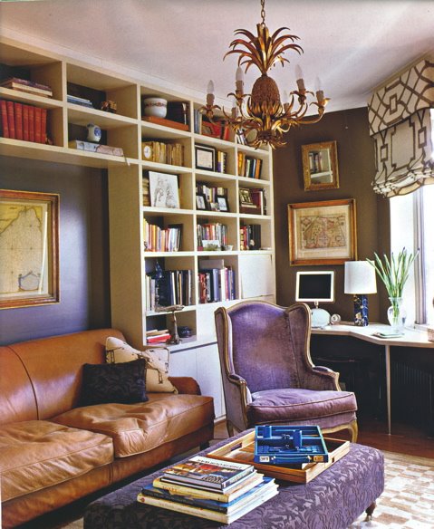
Here is another supremely gorgeous room, this one by Robert Spiotta. I love the contrast of the worn, cognac leather couch with the hints of purple on the elegant armchair and wallcovering. (Also totally loving that trellis-patterned window shade!) What a fabulous and unexpected way to do a library!

These photos have really convinced me that purple is much more diverse and refined than I previously thought. Majesty and subtlety in one fabulous color? Incredible.

Well, I must be off, but I shall leave you with one more simple, but perfect, purple room......

Living room by Steven Gambrel

Monday, September 13, 2010

Papered places

Bedroom by Markham Roberts

I have to admit that I have a bit of commitment-phobia when it comes to decorating. I like being able to change out pillows, rearrange furniture, switch around pictures, and generally just reinvent a space over and over. Strangely enough, I don't mind painting either, and I like how it easily (and economically) can transform a space.

As a result, I had written off wallpaper as too much of an undertaking (sticky glue, lining up the sheets just right, etc.) and too big of a commitment (as you would have the task of coordinating all future furnishings or purchases to the paper's design).

However, the playful ambiance, the drama, and the gorgeous scenery of the wallpapers that I have come across in my exploration of design have charmed and converted me into believing these to be true art pieces that neither limit nor weigh-down the design but, instead, inspire and punctuate it.


I am most impressed by hand painted, panoramic and chinoiserie-style coverings, like the de Gournay  papers shown above, as used by Miles Redd. To me, they have a whimsical quality, able to make you feel transported to some distant and exotic place.


This lovely pink paper, used by David Kaihoi in his own apartment (which was featured in House Beautiful), is actually antique, dating back to the 18th century. Although it has a little wear-and-tear, as you can see below, the paper maintains its serene and elegant beauty, bringing a kind of ambiance to the space that could not be achieved with paint. (And, yes, I am overly partial to it because of its rosy hue!)


You can also find more contemporary, patterned examples like the damasks and geometric florals below, used by Miles Redd, Markham Roberts, and Ashley Whittaker, respectively.

Paper by Farrow & Ball


Paper by Quadrille

I just love the blend of fabrics and furnishings in this gorgeous bedroom by Miles Redd: the silk curtains, the swoop of the canopy, the Venetian striped rug, the delicate birds and branches on the paper.


Sara Story skillfully brings serene elegance and glamour to the small office area below. If you would have asked me before I saw this picture, "Would you like to have fish covering your walls?", my answer would certainly have been, "No!" But the polish and neutrality of this piscine paper is actually quite beautiful and even calming, as if you, too, are floating in the water.


As you can see, paper wallcoverings are available in a variety of styles, whether picturesque or patterned, and can infuse a space with great depth or even give a room a "story". The designs I like most come from Gracie, Quadrille, Cole and Sons, de Gournay, and Zuber.

I will conclude this post with photos of my two favorite wallpapers (two of my favorite rooms, as well) by de Gournay and Zuber, respectively. They perfectly illustrate the elegant atmosphere and enchanting mood that wallpapers can create. 

Master bath by Miles Redd

Bedroom by David Netto