Showing posts with label Alberto Pinto. Show all posts

Friday, May 6, 2011

King Eclectic

Living room by Alberto Pinto

Known for his creation of elegant, worldly spaces and "haute interior design", Alberto Pinto never fails to supply inspiring rooms to clients and design fans across the globe.

Look at all the different elements he has pulled together to create the living room above: the silk/satin upholstery, the mirrored coffee table, the artwork, the huge screen, the lamps, the flowers. So many pieces working in complete harmony. Just beautiful! 

Have a great weekend!

Thursday, April 21, 2011

Spring Soiree

Table setting by Victoria Pearson

I don't know what it is about spring and warmer days that makes me want to celebrate. Maybe it's that the winter is on its way out and summer (my favorite season) is on its way in. Or maybe it's just my own willingness to be out in the world more, when I don't have to brave bone-chilling winds and "wintry-mixes".

Tablescape by Eddie Ross

Either way, it makes me want to get together with the people I care about and have some fun, and these table settings - done in a variety of bright and cheerful colors - are a great place to start for getting some spring soiree inspiration!

Yellow table setting by Eddie Ross

Dining room and table setting by Alberto Pinto

Funny, but this color scheme makes me think of Mardi Gras! Ha! I love these colors together, though, and the fabulous orchids as centerpieces.

Tablescape by Kelly Wearstler

Lots of gold, grounded by wood and other earthy accents. In typical Wearstler style, this spread is glamorous but with a very LA casual coolness about it.

Dining room and layout by William Yeoward

What post about table settings would be complete without mention of Mr. Yeoward? With collections ranging from table linens and crystal to dining tables and chairs (and several books on the subject), Yeoward's joy for entertaining is unmatched!

Dining room by Dan Carithers

Dan Carithers shows how a more neutral theme can still be festive. This setting, with its casual gingham, comfy chairs, and earthy china (all energized with a pop of color from the cheery chrysanthemums), is sure to make his guests feel right at home!

Table setting by Dan Carithers

Our last two photos of the day come from the brand new online magazine High Gloss. Created by style maven and fellow blogger Paloma Contreras (of La Dolce Vita), High Gloss is a one-stop shop for photos and ideas on interior design, fashion, and intriguing travel destinations. A must read for sure!

Dining room and tablescape by David Jimenez

How sexy and fabulous is this setting? The lighting is the real star here: with ambient light emanating from the lamps and picture lights around the room, and accent lighting on the table from the votives (which are reflected in the mirrored tabletop). I think just about anyone could look good in this kind of setting!

Table setting by David Jimenez

I love how well the orange, from the flowers and china, works with the blue-green of the wall color: such an elegant and modern palette! I would love to get an invite for this fête!

Have a great Thursday, everyone! The weekend is almost here!

Wednesday, September 15, 2010

Luxe lavender

Room by Katie Ridder from Elle Decor

From quietly ethereal to playfully polished, the purple color family has a rich and luxurious feel that imparts a regal presence in a room. It was a color favored by Roman emperors and medieval kings, and is still a go-to shade for those seeking that hint of subtle glamour.

As I look at these pictures, I am amazed at the variety of moods that purple can convey. The paler shades, like the one above, have such a serene quality, a dusky glow, and make you relax a little just looking at them.

The brighter versions, such as the color of the room by Alberto Pinto below, are lively and almost seem mischievous, compared to a pale pink or blue. This is no shrinking violet!


What a wonderfully elegant room by Hal Williamson. I love that the furnishings look beautiful, but seem inviting and comfortable as well.


As usual, the effect can be intensified or lessened, depending on the quantity and quality of the color in the room. In the Veranda showhouse, John Saladino used a shimmering silk in a quiet purple as his only accent color in the room.


However, in a room by Jay Jeffers (another new favorite of mine!), the lavender plays off the other colors in the room to create a more festive, cheerful mood.


Although the grays and creams in Bunny Williams' Park Avenue bedroom have only the tiniest hint of lavender, the room comes off so much warmer and soothing than if gray and beige were used alone.


David Kaihoi (above) and Steven Gambrel (below) up the drama in these two rooms by using more intense shades of purple. I love, love, love Kaihoi's vignette on this secretary!

Notice how moody those purples and greens become when put together in this study. They are so classic, too, and make the room seem part of a large English manor house!


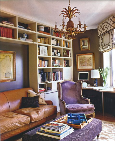
Here is another supremely gorgeous room, this one by Robert Spiotta. I love the contrast of the worn, cognac leather couch with the hints of purple on the elegant armchair and wallcovering. (Also totally loving that trellis-patterned window shade!) What a fabulous and unexpected way to do a library!

These photos have really convinced me that purple is much more diverse and refined than I previously thought. Majesty and subtlety in one fabulous color? Incredible.

Well, I must be off, but I shall leave you with one more simple, but perfect, purple room......

Living room by Steven Gambrel