Showing posts with label Michael S. Smith. Show all posts

Wednesday, November 4, 2015

There was a little girl who had a little burl

Hamptons home office by Carrier and Company

Hello, all! I hope everyone is having a good week so far! I got sidetracked recently, brainstorming room ideas after I saw the picture below. It is such an interesting color scheme and it made me think of the burl table I just marked down over on Chairish. That got me thinking about other ways to style it and here we are!

Living room by Barbara Barry

I like how there is not much color here, but the room has such depth. It manages a balance of warm and cool tones that makes for such an elegant room. I know y'all are going to get sick of me posting stuff about the items I have for sale but I chose them because I thought they were beautiful: in form, in color, in style. This table in particular:


Its smooth curves and combination of olive burl and macassar ebony woods caught my attention immediately. The colors on it are so lovely and it somehow manages to ride the line between modern and classic.

Pretty book matched burl tabletop

I could go on and on. Ha!

Michael Smith's Palm Springs home via Architectural Digest

I saw a similar table in the Architectural Digest article about the completely renovated Palm Springs home of Michael Smith and James Costos. (It's hiding there in the back of the picture above.)


You guys have got to check out that article. The house is so neat!

Vignette with burl wood console by Lilly Bunn

Palm Beach living room by Cullman & Kravis

I really think this table could fit in many different settings, but I kept coming back to the idea of it in a room with similar warm tones.

Phoebe Howard from her book Mrs Howard Room by Room

Then I started thinking how neat it would be contrasted against darker walls, but still in a more casual, comfortable color.

Room by CeCe Thompson Green (a Bunny Williams protege) via DiCorcia Design

And, coincidentally, an olive green room by Ms. Bunny Williams herself

So using these images and the nascent autumn as inspiration , I came up with a room of my own:

Foliage / Lamp / Table / Bird Prints / Sofa / Pillow / Pillow / Curtains / Chair / Chair Fabric / Paint Color

Unless you want a moody, enveloping room (which is fun too), it's good to keep the curtains and larger upholstery in the space light. I love these Anthropologie curtains; they really do make me think of falling leaves! I love hints of a theme in a space, so that's why I did birds on the pillows and the framed prints. You gotta have fun with it!

I hope this gives you some ideas for your own home! Have a great day!

Friday, July 29, 2011

No Small Task

Arrangement by Brad Ford

I have been working on my small home office/study recently and am currently researching lighting options. Although I sometimes do lean toward the traditional (a classic bouillotte lamp is one of my absolute faves), I can totally see the stylistic benefit of modern pieces. 

Bedroom by Barbara Wiseley

More specifically, I am focusing on task lamps and the way that such a decidedly modern lighting fixture can be juxtaposed with more traditional, or even rustic, interiors to create the feeling of a perfectly curated space.

Bedroom by Michael S. Smith

Bedroom in beach house of West Elm creative director, Alex Bates

Although, one must admit, they're quite at home in more contemporary digs as well...

JK Place Hotel in Florence designed by Michele Bonan

Home of Monelle Totah of Williams Sonoma Home

I love the wall-mounted lamps below. What a grand statement they make! Plus, they perfectly frame the artwork and save table space!

Home of Eccola owners Kathleen and Maurizio Almanza

Anthropologie is offering a similar look with their "Robson" sconce. I love its cool, streamlined, industrial look.

Anthro "Robson" Sconce

Photo courtesy of El Sabor de lo Antiguo blog

When chrome and polished nickel versions are used, they act almost as jewelry for the room, adding just the right amount of sparkle.

Living room by Vicente Wolf

How would you use this style of lighting in your own home?

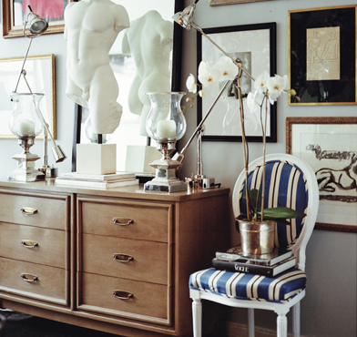
Vignette by Ryan Korban

I love the combination of elements above: the classic Louis XVI-style sidechair, the mid-century mod dresser, the classic sculpture... those fabulous lamps! (Not to mention the presentation of artwork!)

Have a great weekend, everyone!

Friday, January 28, 2011

Inspiration Interpretation

And so it begins....

Artwork by Artman757 on Etsy

Again, this is just an example, but here is how it all started... My friend, "K" we'll call her, saw a painting while we were out and wondered if I could design interiors based on that painting. The painting was not exactly like, but not totally unlike, the painting above. It had horses in it, textural, chunky paint, and maybe an American flag in there somewhere (although K was quick to point out that she doesn't necessarily like Americana kitsch).

So I thought.... and thought.... and thought, then I started looking. I had seen designs (of which style I am unaware) that looked kind of Spanish, kind of California, kind of western, but kind of traditional. So, I set out to find pics that could help me pin down the ideas swirling around in my brain.

Home of Diane Keaton featured in Architectural Digest

It all started coming together when I saw a picture from Diane Keaton's book, California Romantica, that was part of an editorial in a magazine. It displayed (coincidentally enough) a beautiful painting of horses over a heavy wood console. (The photo above is from an older layout in AD.)

Bedroom by Michael S. Smith

I immediately thought of Michael Smith, too. He did a house in Arizona that was featured in last September's Veranda where he employed oriental rugs and heavy wood furnishings to create a eclectic, worldly sort of look.

Vignette by Richard Hallberg and Barbara Wiseley

Vignette by Schuyler Samperton

K is a very fun and colorful person so, when I saw this photo of a stylish but playful room by Miss Samperton, I knew it had to be considered as well.

Design by Joe Minton

And you can never really go wrong with bright, blue-and-white pottery (especially when paired with heavy, wood furnishings).

So, with all of these photos as inspiration, I created the following living room....


These are just a few of the items I put together for K's future living room. (The layout of the room would obviously depend on her future apartment's design.) The background would be the wall color, Cape May Cobblestone by Benjamin Moore. The plein aire-style painting is by Tom Brown, the Karlstad sofa is by IKEA, the linen ikat curtains are West Elm, and the rug is World Market. The blue-and-white ginger jar and French altar candlestick lamp images were found in random online searches, while the metal scrollwork bench and English barley-twist cabinet are antiques found at a local antiques gallery.

K said she wanted interiors she could grow into and layer onto, and I think these pieces would give her home a sense of style, while still allowing her the freedom to build her own collections of artwork and accessories over time.

So.... what d'ya think? (Please be kind! I am a beginner after all!)

Have a great weekend, everyone!

Sunday, January 23, 2011

Style Definition

William Yeoward's most recent book

William Yeoward is quite the creative personality. He has collections of china and crystal, lighting and linens, even furniture. He is British through and through (and was even granted a Royal Warrant of Appointment as a supplier of glassware to HRH the Prince of Wales), but he is not the least bit stuffy or pompous. His homes showcase his playful demeanor and joie de vivre, as well as his love of nature and graciousness to his guests.

Margot cushion on chair covered in Louisette Damson fabric

Yeoward's collection of fabric for the exuberant Designers Guild firm (helmed by Yeoward's colorful - but kindred - spirit, Tricia Guild) showcases his style: velvets and linens mingle to create patterns bursting with personality.

Collection of cushions from William Yeoward's line with Designers Guild

I've been flipping through my copy of his wonderful book, William Yeoward at Home: Elegant Living in Town and Country this morning (which displays much of his fabulous fabric collection), and I realized how much I identify with his style. I think he is bit more daring than me (and, perhaps, a bit more modern), but his love of playful, comfortable, and colorful interiors certainly hits close to home.


One thing that Mr. Yeoward does not shy away from is the mixing of patterns. Here I have brought together my own random assortment of pillows (some old, some new) on my newly inherited settee (casually covered in a blush-pink slipcover/sheet).

The lamp is antique (a lovely hand-me-down from my mother), the vase is actually an old jug from my family's milk business, Turner Dairy (which was sold and renamed in the early 20th century), the aqua shell dishes are by Bamboushay Pottery in the BVI, and the picture is one I took in Portofino, Italy, just a few days after my 21st birthday.


I have turned my dining table into a library table, of sorts, covered with a vintage barkcloth drapery (in a fabulously colorful ostrich-feather pattern), some design books (Michael S. Smith's Houses, Elle Decor's Style and Substance, and a vintage English interiors book I found at a discount store recently), and my lovely tulipiere.


Connected to my living room is a small, bright, breakfast room where I house my dining chairs and a small table for quick meals. Both tablecloths are vintage: the pink one is from the home where I grew up whereas the blue-green one was found in an antique shop in my hometown. The pillows are custom, the prints are also from my childhood home, and the plates on the wall are vintage Franciscan.

My living room couch with custom pillow and Sferra throw

I can only aspire to have the creativity that is so brilliantly illustrated in Mr. Yeoward's homes and creations, but I am thankful to have them as inspiration all the same. 

William Yeoward "Gosford" Dinner Plate

This plate, alone, epitomizes the whole color scheme for my living room: blue, purple, green, and orange surrounded by gilded accents. Perfection!

Here's to those who inspire us!

Have a lovely weekend!

Friday, January 21, 2011

Bust a Move: Part I

Design by Michael S. Smith

I love accessories that have a weathered and sort of historic appeal to them, and busts certainly achieve that look. They seem regal and serious, bringing a stately mood to just about any interior.


A few months ago my mother bestowed upon me a bust that had been recently, well, busted. It was dropped by some movers and, she felt, ruined. But I liked the aged look it gave to the poor guy (seen in the photo above with his broken nose) and took him in as my own.


I'd say he fits in quite well with my random assortment of things!

Living room by Martensen Jones Interiors

I kind of like this smaller, more modern variation of a traditional bust. It suits the clean, bright interiors well, don't you think?


Photo courtesy of Cote de Texas

Conversely, the bust above seems right at home in this dark, opulent, and masculine library.

Foyer by Delphine Krakoff

Miss Krakoff gives the foyer above a touch of Hollywood glam with this intense and gilded model.

Design by Steven Sills
This vignette exudes a warm, but museum-like, feel. Is it me, or do the bust and antique mirror totally steal the show here?

Home of Tony Baratta courtesy of NYSD

I love the collection of busts and other sculpture displayed on these amazing shelves. So grand and, yet, so modern!

Design by John Saladino

This last photo for the day is from one of my favorites: John Saladino. His use of silk, stone, and architectural elements big and small, make him the most elegant of minimalists, giving his interiors the "aura of a Renaissance painting" (says one author).

Have a wonderful weekend and look out for more to come next week!

Tuesday, December 28, 2010

Bedroom challenged

The bedroom in my new place is a little on the small side, but it is cozy and comfortable. The problem is, it is not quite "done". It needs curtains, maybe a bedding revamp, but I cannot decide what direction to take it in, what colors and fabrics to use, etc.

So, I thought today's post would be a small sample of bedrooms that I think are fabulous and are currently giving me some design inspiration.... despite the fact that silver-plated canopy beds are unlikely to be in my future!


Bedroom by Michael S. Smith

The room above is cozy, yet elegant and worldly, definitely what I'm looking for in a room.

Bedroom by Delphine Krakoff

This room by the spirited Miss Krakoff is so glam and modern, yet plush and luxurious, again, aspects I would love to have in a bedroom.

Bedroom by Alex Papachristidis

This is one of my absolute favorite rooms of all time. Although my design personality leads me to more layered and colorfully eclectic interiors, I cannot help but be overcome with admiration for the sheer beauty of this room. The drape and color of the curtains, the contrast of the gold frame of the mirror and the warm wood tones on the Biedermeier chest to that gorgeous wall color, the chandelier, the plush bedding, and the scarce, yet engaging accessories all combine to create this extravagantly elegant space. Papachristidis is, to me, one of the all time greats.

What are your favorite aspects of a bedroom?