Showing posts with label Suzanne Kasler. Show all posts

Monday, June 6, 2011

Take Home: Bernd Goeckler

Foyer in home of antiques dealer Bernd Goeckler - Photo courtesy of NYSD

I hope everyone had a very nice weekend! So, today I want to do something a little different...

I saw this picture of Mr. Goeckler's home and thought it was so beautiful and unique: one of those spaces that, I fear, many people may look at and think, "I could never make my house look like that."

Well now, that just makes me sad! I think good design is available at any price point. Yes, sometimes it takes time and a lot of scrimping and saving, but it can happen. And that's exactly what I want to prove today!

So, let's take the foyer above as our first example. The main focus of this space, to me, is that enormous tapestry. Where can we find such a thing? I'll use 1stDibs to aide in our search....

Grand 17th C. Gobelin Tapestry from Ambiance Antiques on 1stDibs

Here we go! This is perfect: 17th century and Flemish, just like the one in the picture! And, at 9 by 14 feet, it's only $715 a square foot (aka, $90,000 total)!

Oh, too expensive, you say? Yeah, I hear you. I was going to use that money for my weekend on Necker Island anyway.

17c Flemish Tapestry from Balzac Antiques on 1stDibs 

Okay, here we go! This one is not quite as big (only 8 by 10 feet), but it fits the bill and is less than half the price of the other one!.... Only $32,750!

What? Still too pricey for you? Alright, alright, you strike a hard bargain, so I will show you one more....

French Aubusson tapestry from English Accent Antiques on 1stDibs 

So here it is! It's our smallest yet (6 by 9 feet) and French instead of Flemish, but the colors are perfect and, at only $17,500, you are surely going to want to snatch it right up.... right?

Ha ha! Okay, these are all amazingly beautiful pieces, but, all kidding aside, finding a true bargain - especially when you are attempting to translate fabulous interior design into accessible furnishings for your own home - is a real challenge!

But, I think I can help... Let's take a look at Mr. Goeckler's foyer once again...


So, I'm seeing five key components in this space: wall hanging, chairs, console, mirror, and lighting. (We'll take care of the accessories a bit later.)

Let's start, again, with the tapestry. Now, when looking for a bargain (as I'm sure you're all aware), you really have to make compromises. Here, we will have to compromise on color, quality/age, and, especially, size, but that does not mean we can't have a gorgeous finished product!

Vintage Tapestry from Etsy seller Allmndjy

Here is a lovely example of a tapestry that someone on a budget (isn't that everyone?) can afford. It is $110 and, at 2 by 4 1/2 feet, is an appropriate size for most entryways.

Now we need some chairs to go in front of our hanging...


I found these two Louis XVI-style chairs at the Home Goods here in Birmingham. They are a warm (but not too dark), wood finish and are upholstered in a really lovely linen fabric. At $149 each, they are not too hard on the pocketbook and are a similar style to those in our sample foyer. (For a comparison, Ballard Designs offers a similar chair, in a multitude of fabrics and finishes, starting at $329.)

Next, we need a console table...

Handpainted Balustrade Console by Wisteria

I really like the lines of this one by Wisteria (although I'm a little peeved that they upped the price $40 - to $229 - in the week or two since I've been looking at this item). The arching metal work below the apron mimics the shape of the one in the sample photo, and the dark, black finish gives it a stand-out, graphic look.

Now we need a mirror to hang over this pretty piece...

Art Deco Mirror by Ballard Designs

I like this one by Suzanne Kasler for Ballard Designs for $169. It has a clean, slightly rectangluar shape, a pretty mirrored mosaic surround, and, at 32 inches wide (when hung in landscape orientation), it is a good fit over our 44 inch wide console. (Plus it has that sort of French modern thing going for it too!)

Now for some lighting...

Nautical Mini Pendant Light by Hampton Bay for Home Depot

I am a big fan of brass. It's not a material you see much anymore, but I see a comeback soon!

This little pendant light would be so neat in an entryway, a sort of unexpected use for this style, and it is only $40! Speaking of unexpected, I think our sconces for either side of the mirror really need to pack a style punch...

Pair of Brass "Beehive" Mid-Century Modern Sconces from RetroReality on Etsy

So here you go! Punchy and modern and totally fun, these sconces weigh in at only $50 (for the pair) and give the space a happy, mod twist. 

So, these items take care of the basics for the space. Now we need all those finishing touches that will add polish to the design.

First, we need to find a curtain like the one in the background of the photo.

West Elm Luxe Curtain in Zinc

I just adore the color and shimmer of this one by West Elm, and the way they did the pole pocket with hidden tabs gives it the look of expensive pleating at the top. It is only $59 for the 48 by 96 inch panel, which can cover your front door, closet, or hallway while adding a ton of drama to the space.

If you own your home (or are allowed to paint in your rental), I would go for a crisp, neutral backdrop as Mr. Goeckler did, and use white paint for the walls.


I would use White Dove by Benjamin Moore. I know, white is white, right? Well, sort of. Some whites come off very bright, some almost blue, while some have pink or yellow undertones. (You could paint a bunch of swatches side-by-side, or you could just take my word for it!) White Dove has some warmth to it, so it wouldn't be too glaring. I think the style of this foyer dictates the need for softness.

Okay, what now?.... Oh, books!

A variety of design and garden books from discount book seller, 2nd and Charles

Well, let me back up: I would hang the tapestry about 6 inches down from the ceiling (if you have 8 foot ceilings) so that the bottom would hang just a little bit behind the back of the chairs. Then, instead of putting the chairs on either side of the tapestry, mix it up a bit, and put them side by side (about 3 or 4 inches apart), slightly off center of the tapestry. Then you can take your little stack of books (the stack shown above was $120) and sit them on the floor next to one of the chairs. How casually elegant!

Next, we will find some accessories for that console!

***To be continued in the next post***

Monday, April 25, 2011

Orange Crush

Design by Gil Schafer

Orange has become one of my all-time favorite colors. Without conscious intention, this cheerful hue slowly permeated my home in the form of pillows, throws, urns, and mats around favorite pictures. Before I knew it, orange was the color I was turning to to brighten up every corner of my home!

Vignette by Suzanne Kasler

Apparently these designers feel the same way, as they have brought orange to a bevy of their own design projects. Suzanne Kasler seems to especially favor the color, using it as an accent in many of her elegant spaces.

Foyer by Suzanne Kasler

Living room by antiques dealer Angie Warwick - Photo courtesy of Country Living

Whether used as an all-over wallcolor or just in touches throughout a room, I think this color brings a cheerfully modern warmth to any space.

Design by Jay Jeffers

Bedroom by Amelia Handegan

I love the apricot undertones of the happy wallcolor above.

Great room by Kemble Interiors

Here, citrusy pops of color from the accessories brighten up the grays and blues of this cushy seating area.

Foyer by Tom Scheerer

Tom Scheerer chooses a bold red-orange shade for this foyer....

Living room by Todd Alexander Romano

.... while Mr. Romano selects subdued, rusty tones for the upholstered pieces in this arrangement.

Design by Cathy Kincaid

Living room in home of Eric Cohler - Photo courtesy of NYSD

Whether used in spaces that are metro-modern or tastefully traditional, this color is at home anywhere!

Dining room by Timothy Whealon

I always like to end with a photo that, for one reason or another, stands out to me. I absolutely love the room below. You can just tell that a creative force lives here. There is something so bold and yet so comfortable about this space, making it one of my absolute favorite rooms.

Living room in home of hair guru John Barrett

Here's to a great week ahead!

Monday, September 20, 2010

Brilliant

Entry by Jay Jeffers

It's Monday and, as I'm sure everyone's dragging a bit, I thought I would feature some interiors that are luminous and light. Surely the radiance of these rooms can clear up even the cloudiest of Mondays!

Home of fashion designer Jill Stuart

What these rooms lack in color (most offering a strict palette of white on the walls and upholstery), they certainly make up for in style and elegance!


Home of photographer Victoria Pearson

I love how the color white has a chameleonic property to it, working with just about all interior styles. In that way, it would seem to act as a neutral, but, to me, it is a quite potent color, defining the spaces in which it's used.

Living room by Steven Volpe

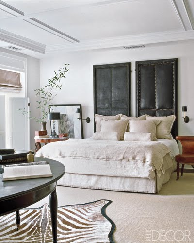
Bedroom by Suzanne Kasler

Suzanne Kasler favors white walls for many of her projects. "White defines and strengthens the architecture, so it lends itself to being the most beautiful backdrop for design."


How elegant is this living room by Eric Cohler! I love how the framing and millwork on the walls are whited out so that they are noticeable, but don't steal all the attention away from the intriguing furnishings and objets (like that amazing sculpture and crystal obelisks).


I like how Ginger Barber uses whitewashed walls and crisp bedding to give this bedroom a light and fresh feel. I love when white is paired with equally airy furnishings, such as sisal carpets or lucite furniture.

Dining area by Timothy Whealon

Darryl Carter is another designer who favors white spaces. "White generally creates an unobtrusive background, allowing your art and furniture to speak for themselves," he says.

And, in these last two rooms by Carter, they speak volumes.


Here's to a bright and happy week!

Thursday, September 9, 2010

Creature comforts

One of my new favorites in the design world is animal print. I am just dying to use this somewhere! It can add such texture to a room, plus a bit of whimsy (and wildness)! Of course, it should probably be used in limited quantities or you risk ending up like the poor leopard lady on Thom Filicia's Tacky House!


For instance, this royal blue, zebra-striped entryway by Ashley Whittaker is definitely risky, but, since this is the only place in the home where she uses this much pattern, it acts as a playful introduction to the rest of the relatively serene design.

Even the smallest dose of leopard, zebra, or tiger can add such playfulness to a room, or give a formal room an exotic edge.

Although I love all the animal prints shown in this post, I am intrigued by the tiger stripe shown in these next few photos. This first picture is a study designed by Albert Hadley and illustrates how to give a traditional room an unexpected twist.


Markham Roberts also employed this pattern in several of his projects (above and below). To me, it is less conventional than the other prints.


Roberts also explores animal print as a flooring option in the absolutely gorgeous room below.


I just love the contrast of the traditional landscape painting and armchair with this leopard rug!


Richard Mishaan has the same idea in the living room above, where he uses a faux deer hide rug to add another subtle texture to the muted patterns already on the armchairs and ottoman.


Jeffrey Bilhuber uses a leopard pattern to carpet the foyer and stairs of this lovely home. Many people may fear that the use of this much leopard would be tacky or extreme, but, as Bilhuber shows us here, it can be incredibly elegant!

Zebra is another fun pattern to introduce in a room due to its graphic black and white coloring. Even the smallest hint can be dramatic, as Skye Kirby of Lillian August says, "a little bit of zebra goes a long way"!


Kirby illustrates this idea by using just a touch of zebra in the crisp living room above.


Mary McDonald limits her use of animal print in this room to one classic ottoman, while Joe Nye mixes it up below with leopard in the serene study of his West Hollywood residence.


Throw pillows bring a flash of fauna to these rooms by Stephen Shubel (above) and Markham Roberts (below).


At The Parker hotel in Palm Springs, Jonathan Adler puts a bamboo and leopard bench at the foot of a bed, adding a far-east flair to the mod style of the rest of the room (below).


So, are you hearing the call of the wild yet? (Ha!) Alright then, I will end this post with a couple of photos from the home of the queen of subtleties, Suzanne Kasler. With a deft hand, she combines pieces of all different styles to create truly inspired interiors.

 
And one of my all-time favorite rooms....