Showing posts with label Richard Hallberg and Barbara Wiseley. Show all posts

Wednesday, September 12, 2012

Light and Dark

Has it been too long? Why, yes, yes it has. So let's get a move on, then!

Sunlit Alabama home by Tracery Interiors

One of my friends recently repainted her home and she was worried over whether or not the color would be too dark. This is a reasonable concern if you're going for light and get dark by mistake. But, if you just can't decide between the two schemes, then lets do some comparing... 


Gallery style arrangement by Eric Cohler

Dark means cozy and sexy. Dark rooms have an instant ambiance that bleached interiors just can't imitate.

Bedroom by Hallberg and Wiseley

But, man, bright rooms sure are nice! Isn't this bedroom fabulous? I love the African accents, like the Kuba cloth pillow and chief chair, alongside the modernist headboard and wonderful Artemide Tizio lamps.

Living room by Dan Carithers as featured in Southern Accents

Are you looking for cozy....

Living room by Jesse Carrier

Or open and airy?

Salon by Katie Leede-McGloin for Veranda's Greystone Showhouse

Saturated color....

Spanish style interiors by Mark J. Williams (I think)

Or totally white-washed?

Den by Elaine Griffin

This room is nice because it gets so much light during the day, but don't you just know that, at night when those wonderfully textural shades are drawn, it just comes to life in a different way, with those chocolate walls just enveloping you?

Living room by Christina Rottman

I love this space. It is simple, but comfortable. It has an artist's loft sort of look, and I love how the window showcasing that amazing greenery looks like a piece of art itself.

Study in home of John Dransfield and Geoffrey Ross

Another fabulous room from one of my favorite houses EVER. It was featured in Elle Decor a few years back and the interiors of Dransfield and Ross' lovely home amaze me still. (Yes, I still have my 2010 copy. Don't judge my packrat ways.)

Bedroom by Mark J. Williams

Umm, yes please. I want this bedroom. Although I am obsesssed with canopy beds (see here), a true canopy bed can be a bit much. (Have you ever slept in a true, totally upholstered one, because it gets HOT!) However, I love this incarnation. Hanging the fabric from the ceiling gives you that same canopy-like cocoon, while accentuating the height of the room and leaving the space feeling airy and light. I also just adore that furry carpet... What better way to hide the sheddings of your own furry creatures!

Over the years I have done light and dark. My bedroom in a previous home was a pinky-chocolate color whereas my house now is coated with layers of glossy, quarter-formula Cliffside Gray from good old Ben Moore. I think different phases in life need the appropriate alterations in the home. That way your home always reflects you and stays your own personal haven.

Anyway, I hope you all have a good remainder of your week, and I will be back again soon!

Friday, July 29, 2011

No Small Task

Arrangement by Brad Ford

I have been working on my small home office/study recently and am currently researching lighting options. Although I sometimes do lean toward the traditional (a classic bouillotte lamp is one of my absolute faves), I can totally see the stylistic benefit of modern pieces. 

Bedroom by Barbara Wiseley

More specifically, I am focusing on task lamps and the way that such a decidedly modern lighting fixture can be juxtaposed with more traditional, or even rustic, interiors to create the feeling of a perfectly curated space.

Bedroom by Michael S. Smith

Bedroom in beach house of West Elm creative director, Alex Bates

Although, one must admit, they're quite at home in more contemporary digs as well...

JK Place Hotel in Florence designed by Michele Bonan

Home of Monelle Totah of Williams Sonoma Home

I love the wall-mounted lamps below. What a grand statement they make! Plus, they perfectly frame the artwork and save table space!

Home of Eccola owners Kathleen and Maurizio Almanza

Anthropologie is offering a similar look with their "Robson" sconce. I love its cool, streamlined, industrial look.

Anthro "Robson" Sconce

Photo courtesy of El Sabor de lo Antiguo blog

When chrome and polished nickel versions are used, they act almost as jewelry for the room, adding just the right amount of sparkle.

Living room by Vicente Wolf

How would you use this style of lighting in your own home?

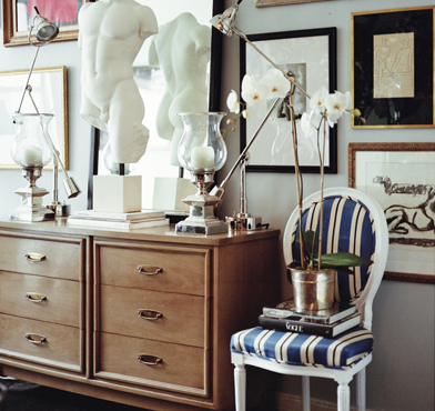
Vignette by Ryan Korban

I love the combination of elements above: the classic Louis XVI-style sidechair, the mid-century mod dresser, the classic sculpture... those fabulous lamps! (Not to mention the presentation of artwork!)

Have a great weekend, everyone!

Friday, January 28, 2011

Inspiration Interpretation

And so it begins....

Artwork by Artman757 on Etsy

Again, this is just an example, but here is how it all started... My friend, "K" we'll call her, saw a painting while we were out and wondered if I could design interiors based on that painting. The painting was not exactly like, but not totally unlike, the painting above. It had horses in it, textural, chunky paint, and maybe an American flag in there somewhere (although K was quick to point out that she doesn't necessarily like Americana kitsch).

So I thought.... and thought.... and thought, then I started looking. I had seen designs (of which style I am unaware) that looked kind of Spanish, kind of California, kind of western, but kind of traditional. So, I set out to find pics that could help me pin down the ideas swirling around in my brain.

Home of Diane Keaton featured in Architectural Digest

It all started coming together when I saw a picture from Diane Keaton's book, California Romantica, that was part of an editorial in a magazine. It displayed (coincidentally enough) a beautiful painting of horses over a heavy wood console. (The photo above is from an older layout in AD.)

Bedroom by Michael S. Smith

I immediately thought of Michael Smith, too. He did a house in Arizona that was featured in last September's Veranda where he employed oriental rugs and heavy wood furnishings to create a eclectic, worldly sort of look.

Vignette by Richard Hallberg and Barbara Wiseley

Vignette by Schuyler Samperton

K is a very fun and colorful person so, when I saw this photo of a stylish but playful room by Miss Samperton, I knew it had to be considered as well.

Design by Joe Minton

And you can never really go wrong with bright, blue-and-white pottery (especially when paired with heavy, wood furnishings).

So, with all of these photos as inspiration, I created the following living room....


These are just a few of the items I put together for K's future living room. (The layout of the room would obviously depend on her future apartment's design.) The background would be the wall color, Cape May Cobblestone by Benjamin Moore. The plein aire-style painting is by Tom Brown, the Karlstad sofa is by IKEA, the linen ikat curtains are West Elm, and the rug is World Market. The blue-and-white ginger jar and French altar candlestick lamp images were found in random online searches, while the metal scrollwork bench and English barley-twist cabinet are antiques found at a local antiques gallery.

K said she wanted interiors she could grow into and layer onto, and I think these pieces would give her home a sense of style, while still allowing her the freedom to build her own collections of artwork and accessories over time.

So.... what d'ya think? (Please be kind! I am a beginner after all!)

Have a great weekend, everyone!