Showing posts with label Hal Williamson. Show all posts

Thursday, December 9, 2010

The Real Living Room: Part I

Design by Peter Dunham

I will go ahead and admit it: I am no chef. Not even close. I make coffee and that's about it. But, since my move to a home with a kitchen that is less than six feet wide and counterspace at a premium, I have come to appreciate this room quite a bit more.

Design by Phoebe Howard

Many kitchens (especially those exceeding 42 square feet) are truly the heart of a home, where the family congregates and meals, stories, and laughs are shared. In that way, they seem to be the truest living rooms of all.

Design by Krista Ewart


I think what I appreciate so much in these featured kitchens is that they look like actual rooms. It seems so often that the style of the kitchen is disjointed from the rest of the home. It is understandably hard to create that synergy between the kitchen's modern appliances and materials and other living spaces' more traditional (or, sometimes, antique) furnishings.

However, I believe these designers have created rooms that carry the feeling, colors, and style from the rest of the home into the kitchen just beautifully. (Isn't that little pink fridge above so fun? It is a line called Smeg, carried by Sears. Even cooler is the fact that for every pink fridge sold, Smeg will donate $100 to the American-Italian Cancer Foundation.)

Kitchen by Phoebe Howard

Design by Katie Ridder

I think the use of color and accessories, like rugs, aides in creating warmth and carries the style of the home into the kitchen. I love the rug in the kitchen by Peter Dunham at the top, the cabinets in the kitchen by Mrs. Howard (they look like beautiful French doors), and the chairs used by Miss Ridder above. All of these items bring texture to the space that typical cabinets and countertops alone could not.

Design by Hal Williamson

Even limited space is not an issue for these talented designers. The narrow kitchen above becomes an exotic and sunny sitting area due to large windows and the whimsical banana-leaf wallpaper (a Beverly Hills Hotel signature), while the one below is made cozy with warm colors and interesting details, like the round window, vintage pendant fixtures, and checkerboard floor.

Design by Cathy Kincaid

I think this is a perfect room to end with today. It is elegant, comfortable, and efficiently functional. Great design all around!

Have a great day! 

Wednesday, November 17, 2010

Pattern at play

Design by the fabulous Hal Williamson

I may experiment with color, but, for some reason, piling on the pattern has always intimidated me, whether in fashion or interior design. It is a shame because, as these designers show, that layered look creates warm, engaging, and, often, dramatic rooms.

Design by Omniarte

Whether using a bold pattern like the wallpaper above, or a combination of prints, the effect is really dynamic and interesting.


The pic above is from decorator Milly de Cabrol's New York apartment as covered in New York Social Diary. I love how she piles on the printed fabrics (and books and art!) in this room, draping the table and settee in hand-blocked prints, giving the room a really cozy feel.

Bedroom by Katie Ridder

I love the subtle patterns Ridder uses above. Isn't that headboard just lovely? The room feels so airy, but textural too.

Den by Raymond Boozer from Apartment 48

I am a huge fan of a chevron pattern. Doing the couch in tone-on-tone greens keeps it from being too bold, while still mimicking the pattern in the rug.

Dining room by Schuyler Samperton

Schuyler Samperton combines traditional and trendy patterns here perfectly, using an ikat on the dining chairs over a gorgeous oriental rug. (Check out the beautiful wall panel in the background!)


I really can't get enough of Phoebe Howard's designs! She is so talented! The vignette above is so well-composed: the splash of color, the textural tortoise shells, the mirror, the avian prints. Look closely and you will see that the wallpaper has the most subtle pattern on it, giving even the walls a woven effect.

Our last two photos of the day come from designer Stephen Sills.


Now this is the way to bring energy to a room by using pattern! Love the rug, love the throw on the back of the couch, love the stripes on the ottoman. (And I totally love that leather chair!) This room is warm and comfortable, but artful and stimulating as well.

Another space by Sills is featured in this month's Architectural Digest (which is newly helmed by ex-Elle Decor editor Margaret Russell) and the interiors are so amazing, you must go get a copy immediately! It looks like Russell is really going to up the ante and makeover AD in the best possible way. I can't wait to see what's next!

Here is a taste of Sills fabulous AD-featured design.....


Heaven!

Have a wonderful Wednesday!

Tuesday, October 26, 2010

Sur la table: Part II

Tablescape by Joe Nye
As I laid out in the first segment of this post, I have recently become wild for table settings. I have not done a lot of entertaining, but I am eager to begin!

It seems like an art, though, to not only weave together an attractive layout for guests to survey (i.e., the combination of china and flatware, flowers and linens), but also to prepare a meal appropriate for all palates (which is a delicate and logistically challenging process in and of itself). 

How gorgeous is the setting by Joe Nye above? I love that fabulous bamboo flatware and the contrast of the blue bowls and plates with the other, more neutral items on the table.


Isn't this warm and sunny setting by John Peixinho so perfect for fall! The bright yellow tablecloth and the warm, rusty orange china create an easy, autumnal ambiance, while the simple glassware keep the layout from being too heavy.


Table setting by Ralph Lauren

Did someone say "cozy"? Oh yeah, I did! Well, if you are getting in the mood for elegant, but comfortable dinners at home, here are some pics for you! (I love the blanket thrown over the back of the chair above! What a good idea for making the scene more casual and inviting, especially if the weather outside is frightful!)

Table design by Mimi Maddock McMakin

Table setting by Jeffrey Bilhuber

Now, if you are all about glamour, these last two photos are for you. (But, seriously, who doesn't love a huge, sparkling chandelier?!)

Room by Jacques Grange

Pink, pink, and more pink! I can't imagine why this room by Jacques Grange caught my eye! I do think that the pink creates a lightness in a room that could easily become overly formal. The dining table is large and solid wood, but it feels so fresh with the rosy linens, subtle florals on the plates, and delicate orchids crowning the whole arrangement (as well as leading your eye up to the drapey chandelier).

Here is one last example of a lovely table; this one set by the colorful Hal Williamson in his clients' New Orleans home. I love the color of the walls (Shantung by Martha Stewart for Sherwin-Williams) and the crystals dripping from the chandelier. I also love how personal this room is. The photo on the wall is of a local gospel singer done by a local artist, and the toile on the chairs features historical images of the Louisiana Purchase and was created by New Orleans enthusiast, Roulhac Toledano of Architextiles.


I love the amethyst glasses that so perfectly contrast with the simplicity of the tablecloth, china, and other linens, but perfectly complements the wall color and toile on the chairs. I recently purchased a set of Franciscan amethyst goblets and can't wait to create a setting like this to display them!

Here's to a fabulous table with lots of friends and family to gather around it!

Friday, October 8, 2010

Mirror, mirror, on the wall....

Unknown

As I mentioned in my previous post, I cannot get enough of mirrors. I love how they enhance a space, making it feel larger and more polished. Although they cannot take the place of engaging artwork, mirrors are a design necessity in my eyes, creating focal points and vignettes in just about any space.

I absolutely love the antique mirror above, used here as a headboard. The piece takes the existing glamour in the room to a new level, and adds dimension and openness that one in a dark wood finish could not.

Photo by Chris Court

Again, the mirror is creating the illusion of space in this already large office. It adds sparkle and depth, and is quite the appropriate accessory for its fashionable surroundings.


In this lovely, albeit tidy, foyer by William Hodgins, the mirror is functional in that it is nice to take a quick glance at yourself before heading into the world. However, it also acts as a tool to punctuate the scale of the space, ascending all the way to the moldings. (Note the monumental scale of the lantern and mirror, the residential scale of the sconces and door-framing windows, and the human scale of the chairs and table.)


I love trumeau mirrors, and this one is no exception. The finish is neutral but the carvings are intricately elegant; a perfect match with the other proper, yet almost-rustic, furnishings.


I love this dining room in the home of Sonia Kashuk, successful makeup artist and entrepreneur. It is so bright and airy, yet cozy and comfortable. The way the gilded, overscale mirror is casually leaned against the wall further accentuates the easy elegance of the space.


Angie Hranowsky creates a mod vignette in a dining room, contrasting the clean lines of a dresser and crisp white accessories with a swirling gold mirror. I love how the mirror is small and off center, perfectly unexpected!


Mirrors can also be used as wallcoverings, of a sort. Here, Todd Alexander Romano accents a seating area with a panel of antique mirrors. The blend of textures here is wonderful: the parquet floor, velvet bench, leopard print pillows, glimmering mirrors, and the rich darkness of the oil painting.


Melissa Rufty also opts for antique mirrors in her New Orleans home, filling the interior of an antique, carved overdoor with squares of antique mirrors. This seems to give the room more history, and a feeling of permanence. The silk curtains, oriental rug, and crystal chandelier add classy touches of Southern charm as well.


In this fabulous room by Todd Klein (featured in House Beautiful), the mirror is juxtaposed against clean, black-and-white furnishings and a cool blue backdrop. The shimmer of the gold frame, the elaborate bird and leaf design, as well as the scale of the piece make it a showstopper in this space.


How gorgeous!

One last pic from another fabulous Southern designer, Hal Williamson. His interiors are just magical. (You must check out the entire house, when it was featured here in House Beautiful!)

I am already partial to pink, silk, and glittering Venetian mirrors so, to me, this composition is sheer perfection! So beautiful!


Have a great weekend!

Wednesday, September 15, 2010

Luxe lavender

Room by Katie Ridder from Elle Decor

From quietly ethereal to playfully polished, the purple color family has a rich and luxurious feel that imparts a regal presence in a room. It was a color favored by Roman emperors and medieval kings, and is still a go-to shade for those seeking that hint of subtle glamour.

As I look at these pictures, I am amazed at the variety of moods that purple can convey. The paler shades, like the one above, have such a serene quality, a dusky glow, and make you relax a little just looking at them.

The brighter versions, such as the color of the room by Alberto Pinto below, are lively and almost seem mischievous, compared to a pale pink or blue. This is no shrinking violet!


What a wonderfully elegant room by Hal Williamson. I love that the furnishings look beautiful, but seem inviting and comfortable as well.


As usual, the effect can be intensified or lessened, depending on the quantity and quality of the color in the room. In the Veranda showhouse, John Saladino used a shimmering silk in a quiet purple as his only accent color in the room.


However, in a room by Jay Jeffers (another new favorite of mine!), the lavender plays off the other colors in the room to create a more festive, cheerful mood.


Although the grays and creams in Bunny Williams' Park Avenue bedroom have only the tiniest hint of lavender, the room comes off so much warmer and soothing than if gray and beige were used alone.


David Kaihoi (above) and Steven Gambrel (below) up the drama in these two rooms by using more intense shades of purple. I love, love, love Kaihoi's vignette on this secretary!

Notice how moody those purples and greens become when put together in this study. They are so classic, too, and make the room seem part of a large English manor house!


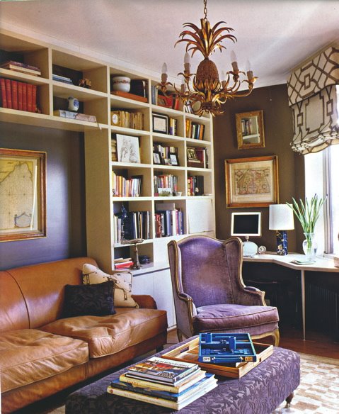
Here is another supremely gorgeous room, this one by Robert Spiotta. I love the contrast of the worn, cognac leather couch with the hints of purple on the elegant armchair and wallcovering. (Also totally loving that trellis-patterned window shade!) What a fabulous and unexpected way to do a library!

These photos have really convinced me that purple is much more diverse and refined than I previously thought. Majesty and subtlety in one fabulous color? Incredible.

Well, I must be off, but I shall leave you with one more simple, but perfect, purple room......

Living room by Steven Gambrel