Showing posts with label Darryl Carter. Show all posts

Wednesday, September 11, 2013

Too long

Here it is: I have no excuse. I have not posted in forever, and it is no one's fault but my own. My apologies. So, with that said, let's get back to it!

Living room by Genevieve Faure - via Architectural Digest

I love this style. Some people have the ability to make each piece, every object in a room, look like a work of art. Your eye happily hops around looking at this thing that is grand and that thing that is diminutive. Just lovely.

By Katie Stassi Scott of Katie by Design

Darryl Carter says, "It's about curating things I love that you wouldn't necessarily think go together." 

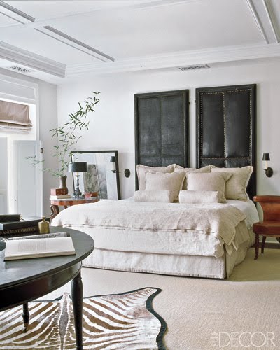
Darryl Carter via Elle Decor

Despite the monochrome of this room, it seems like a very usable and comfortable space. Carter certainly has a knack for restraint and the ability to edit. He says that his design is about "discipline and subtlety". I believe I lack both in my own interiors. A friend once entered my house and immediately stated, "Whoa. You have so much.... stuff!" Ha! Although it is not a philosophy I can live, I can certainly appreciate it.

Foyer by Yvonne O'Brien of The Private House Co.

Texture and sparkle and color all in one lovely vignette!

Timothy Whealon

Can you see how each piece holds its own?

Home of Ronald Bricke - via NYSD

Boys bedroom by Sarah Richardson 

Bunny Williams

Doesn't this chair fabric make you think of a sketching by Matisse?

Victoria Hagan

Hallberg-Wiseley Designers via Architectural Digest

Kay O'Toole of Houston via Cote de Texas

This one is a bit grainy, but what a wonderfully rosy glow! I love that Aubusson rug thrown over the table.

Suzanne Rheinstein via Elle Decor

The pic above has probably been posted a million times, but for good reason! The layout, the color scheme, and the classical furnishings are all done in what feels like a decidedly non-traditional way. 

Suellen Gregory via Veranda

Contrast seems to be the key to this room. I love that she decided against symmetry here and did black lamps on one side of the fireplace and white on the other. It creates that wonderful tension that is so visually arresting.

Frank Babb Randolph via Veranda

I could seriously go all day posting these gorgeous pictures. It really is amazing how many original designs that people can come up with. I love the subtle warmth of this particular room. It also reminds me of how my little sister once told me that I had a serious chair addiction.... Looks like I'm in good company with Mr. Randolph here!

I hope you all have a great week ahead and I will post again soon!

Monday, September 19, 2011

Americana

Dining room by Wendy Meredith

The weekend before last I went to Scott's Antique Market in Atlanta (which is fabulous, by the way), and, although there were beautiful antiques of myriad backgrounds and styles, it was the early American and English antiques that grabbed my attention.

Maybe it's because my interest has been piqued by this style recently (think Darryl Carter and Bill Ingram) because I was working on my traditional, masculine study (pictures to come), but, either way, I have a new and growing appreciation for the classically blended, English-inspired "American" look.

So, today, I thought I would pay homage to that style with some photos of homes that are modern incarnations of classic American design (where Windsor chairs and Wedgewood abound). Enjoy!

Bedroom by Eddie Ross

Breakfast area by Phoebe Howard

So much character in such a small space (with the beadboarding perfectly punctuating the style). 

Grand foyer by Diamond Baratta Design

The formality of this grand foyer is played down by breaking the space up into smaller seating areas and by using durable, unpretentious materials like the embroidered pillows and the braided rug (which was an early American staple since carpets from Europe and Asia were not available - or affordable - to colonialists).

Den by Tom Scheerer

What a cozy but fun seating area: the bold coral of the upholstery against the white walls and wood accents. It is modern without seeming overtly so (especially when Scheerer throws a sculptural high back Windsor and pair of bobbin corner chairs into the mix).

Bedroom by Stephen Sills

Again, another cozy room, this one complete with fireplace, quilts, and those lovely black-and-white lithographs. So warm and serene.

Photo courtesy of Country Living

Classic, a little cluttered, but comfortable!

Bedroom by Chad Eisner

Love the stripes, love the quilt, love the trunk.

Dining area by Windsor Smith

What a lovely room. I am not usually a fan of the Windsor chair, but, here, it is the perfect, graphic counterpoint to the clean white walls. The rustic wood table and interesting artwork so casually propped on the mantle, all handsomely complement this delightful space.

Here's to a great week ahead, everyone!

Wednesday, September 22, 2010

Over the moon for overscale art


Artwork says a lot about a person. (Like that they're a huge Dirty Harry fan perhaps?) I love collections of artwork (as you will see in an upcoming post), but, sometimes, one overscale piece makes a much bigger impact than even a hundred separate pictures could.


I absolutely love this room in the home of Victoria Pearson. It is cozy and earthy, and that wonderful picture of a hawk is the perfect addition. Although it is the only piece of art on the walls, the room doesn't feel like it's lacking in artistic expression. Between the wooden floor lamp and the oversized hawk, the room feels engaging and interesting, while keeping a calm, minimalist air.


Sometimes overscale art can be used to bring a new color into the space. The flowers in the picture above tie into the pale blue/lavender of the pillows, while the green in the background adds a new element of freshness and depth.

The black fabric panel and lampshades in the room by Martyn Lawrence-Bullard below add drama to what would be a rather neutral, airy space otherwise.


Room by Eric Cohler

Overscale art can also bring a graphic element into a room. I love how the pattern in the artwork above contrasts with the ladylike bench and cozy pillows. The same effect is found in the living room at the home of Philip Gorrivan, below. The linear shapes in the photo by Michael Wolf complement the chevron striped curtains, but contrast with the plush sofa and classic console. I love the creative tension these pieces can create!


Rooms above and below by Martyn Lawrence-Bullard


In this gameroom at the home of Windsor Smith, a polar bear overlooks the space, bringing some depth to the endless black walls, but creating a bit of playfulness as well.

Space by Miles Redd

Miles Redd and Peter Dunham both have a handle on playful. I love all of their richly textured and brightly colored work. Their creativity is endlessly inspiring!
Room by Peter Dunham


Even a traditional landscape painting can have the same impact as a more graphic piece when it's done in a super-large size.


Our last picture for the day features an artist I just love (and dicussed at length in a previous post), Massimo Vitali. His prints are always amazing in larger sizes because you can make out so much of the detail that makes his photos so fascinating. 


You don't have to buy artwork from a gallery to achieve this style. I took a photo from a trip to Italy and had it blown up to almost four feet wide! I had it done at FedEx Kinkos and it was not expensive at all! Perfectly artistic, but perfectly personal as well!

Here's to living large!

Monday, September 20, 2010

Brilliant

Entry by Jay Jeffers

It's Monday and, as I'm sure everyone's dragging a bit, I thought I would feature some interiors that are luminous and light. Surely the radiance of these rooms can clear up even the cloudiest of Mondays!

Home of fashion designer Jill Stuart

What these rooms lack in color (most offering a strict palette of white on the walls and upholstery), they certainly make up for in style and elegance!


Home of photographer Victoria Pearson

I love how the color white has a chameleonic property to it, working with just about all interior styles. In that way, it would seem to act as a neutral, but, to me, it is a quite potent color, defining the spaces in which it's used.

Living room by Steven Volpe

Bedroom by Suzanne Kasler

Suzanne Kasler favors white walls for many of her projects. "White defines and strengthens the architecture, so it lends itself to being the most beautiful backdrop for design."


How elegant is this living room by Eric Cohler! I love how the framing and millwork on the walls are whited out so that they are noticeable, but don't steal all the attention away from the intriguing furnishings and objets (like that amazing sculpture and crystal obelisks).


I like how Ginger Barber uses whitewashed walls and crisp bedding to give this bedroom a light and fresh feel. I love when white is paired with equally airy furnishings, such as sisal carpets or lucite furniture.

Dining area by Timothy Whealon

Darryl Carter is another designer who favors white spaces. "White generally creates an unobtrusive background, allowing your art and furniture to speak for themselves," he says.

And, in these last two rooms by Carter, they speak volumes.


Here's to a bright and happy week!