Showing posts with label Paolo Moschino. Show all posts

Wednesday, September 7, 2011

Admiring the view

Foyer vignette by Perch Interior Design

Growing up in a classically traditional Southern home (decorated by my very talented Mother), I was surrounded by landscapes: some dark and moody, almost all oil paintings. Back then (when I was a super-cool pre-teen, listening to Mariah Carey's "Dreamlover" and thinking that all color schemes should be based around a totally '90s pastel floral palette), I thought that they were so drab and boring. "Why even have a painting like that?", I would think.

Entryway staircase in Veranda showhouse by Tim Clarke

Ahh, but isn't that the way of things? You are young and have it all figured out and, then, you get older and you realize you didn't (and still don't) know anything at all! Ha!

My opinion of landscape paintings, for certain, has come full circle. Now, because of their moodiness and depth, they are something I crave for my own home.

Living room by Barry Dixon

This room is so great. I love how he grounds the neutral upholstery, neutral rug, and neutral (and totally fabulous) curtained bookshelves with dark accents on the furniture, on lamps, and accessories. A beautiful balancing act! (Oh, yeah, and doesn't that landscape instantly add class to the whole room, giving it this sort of sophisticated sense of significance?)

Foyer by Yvonne O'Brien

Here, Miss O'Brien breaks from tradition, using a plein air style landscape with a parsons-style console, kuba cloth pillows, and weathered old trunks, all of which makes for an engaging yet clean presentation.

Grand stairwell by Joe Minton

It seems like many designers prefer a neutral backdrop for the artwork they choose, but, here, Minton lives into the grandeur of the ornate woodwork and architecture of this house choosing, instead, a warm damask wallpaper for the space.

Living room by Patrik Lonn

I love the scale of the painting in this room by Patrik Lonn. The whole space has a geometric characteristic to it, I think, due to the clean lines of all the pieces: the painting and the coffee table, angular sofa and stools. It has a modern look to it, but not at the expense of softness and comfort.

Dining room by Phoebe Howard

The inimitable Miss Howard seems to be a fan of landscapes, using them in most of her projects in incarnations both large and small. (Love the combined drama and warmth of this room!)

Living room by Paolo Moschino

I love this space, mainly that facing wall. There is symmetry (for instance, on and above the mantel), but then there are also some individual groupings, like the pair of landscapes and lamps on the marble-top console table. So classic.

Dining area by Country Living editor Randy Florke

Here, again, I am loving the scale. The painting runs almost the length of the table itself, and Florke makes sure not to block the view, using a diminutive (yet quite sparkly) chandelier. (And what an apropos choice for a cozy country house: pairing the painting with gingham and amber-toned dinnerware!)

Dining room by Mary McDonald

And here, last, but certainly not least, is a gracious and elegant dining room by the fabulously fun Miss McDonald. (I mean, have you seen her on "Million Dollar Decorators"? What a hoot!) I love the luxe, aubergine-hued chocolate velvet (or, perhaps, mohair) on the dining chairs, those taupe/gold silk curtains, and glimmering silver accents, all punctuated with the cloudy, moody, and totally entrancing landscape.

What type artwork do you all prefer? Do you think these traditional pieces could work in your own home?

Have a happy Wednesday, everyone!

Tuesday, March 1, 2011

Bamboozled

Vignette by Hillary Thomas - courtesy of Lonny

As I continue to work on the conclusion of my latest "Inspiration Interpretation" post, I thought I would feature a favored material of mine in the meantime: bamboo. Usually faux (but never a faux pas!), bamboo can be used in myriad interiors.

Bedroom by Chad Eisner

I just adore the bedroom by Eisner above. How serene: the combination of the pale bamboo bed and the gray-green of the walls. Restrained, but not bland; comfortable, yet polished.

Breakfast room by Kemble Interiors

Don't these chairs add such great texture to this wonderfully fresh and bright room? I am loving the combination of the bamboo with the beadboard walls.

Living room by Kemble Interiors

In another, slightly more formal room by Kemble Interiors, bamboo still finds an appropriate home: here, as a useful secretary.

Design unknown - photo courtesy of Laurey W. Glenn

I like how the criss-crosses in the mirror mimic those on the lively ottoman. Check out the contrast cording and buttons on the sofa, too; it seems to make the piece much less formal and even a bit playful.

Bedroom by Paolo Moschino

What a great bedroom! It seems so cozy and cottagey... but there are slightly more exotic undertones in it, too.

Living room by Jennifer McGee Design

The glass-fronted cabinet above is in the style of the original Victorian and Edwardian bamboo pieces. This type of furniture was first introduced to the western world through trade with China in the 18th century, and reached the height of its popularity during the late 19th century, somewhat due to the American and English cabinetmakers who created more affordable faux bamboo pieces.

Bedroom by Martyn Lawrence-Bullard
 
What do you think about all this toile? I am inclined to like it. It makes the room cozy, and Lawrence-Bullard maintains a peaceful congruity in the room by keeping the other furnishings (a suite - corona included - of bamboo bedroom furniture) homogeneous.

Dining area of unknown design

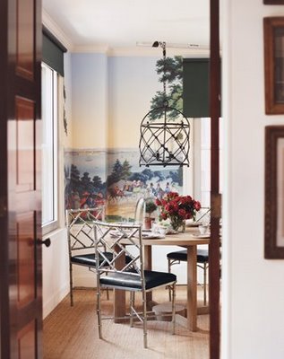
I like how this last pic of the day shows a more modern side of bamboo: metal, trellis-style bamboo chairs congregate around a clean-lined wood table in a small dining room shrouded in colorful panoramic wallpaper (possibly by Zuber). This really is a material that can go anywhere!

Have a great day and check back soon to see the completion of the latest project in my "Inspiration Interpretation" series!

Tuesday, September 7, 2010

Modern Onyx

One wall color I keep seeing everywhere is black. Although I was wary at first, my research for this post certainly gave me a new perspective on how such a sooty hue can be so sophisticated. The amplified drama of these spaces is unquestionable and, therefore, makes them quite stunning visually.

I think the successful application of black has to do with the design's commitment to drama, the availability of light (natural or electric), and/or a homeowner's willingness to live with the almost Victorian formality that the color can imbue into a space.


These first two photos (designs by Tom Scheerer) display that formality I referred to above. The intensity is heightened in the library by pairing the wall color with dark furnishings, while the the intensity is lessened in the living room by painting the area below the chair rail a crisp white.


The bedroom of modern furnishings expert, Troy Halterman (which was featured in Elle Decor's "best of" book, Style and Substance - a must-read for inspiration on chic and fearless interiors), illustrates this color's ability to offset artwork beautifully, creating a masculine and, almost, museum-like quality.


In this lovely bedroom by Paolo Moschino for Nicholas Haslam, the texture of the wall covering and the pale, cool tones of the furnishings provide a soothing counterpoint to the black. 


While furnishings and light may help to dilute the severe effect of this color, one may prefer to limit its use to only one wall, or panel, as shown below in a bedroom by Eric Cohler. (I just love the contrasts here: the white linens against the black panel, and the plush headboard against the sharp lines of the panel squares and Greek key pattern on the linens.) 


In the bedroom above, designed by Thad Hayes, the black and white contrast perfectly to provide a clean crispness to the room. (Hayes' book, Thad Hayes: The Tailored Interior, is on my wishlist of design books.)


In another Style and Substance room, this one created by Matthew Patrick Smyth, black has been used to showcase the daybed area nestled among the wall of built-ins in this office. Again, black does a dutiful job highlighting the abstract art lit by matching swing-arm sconces. (See Smyth's website for more views of this room and all his fantastic projects!) 

These incredible interiors have definitely opened my eyes to the intensity and, yet, remarkable quiet that this inky hue can create, and, I hope, will inspire you to keep an open mind even to the most dramatic of design concepts!